By Ricky Allen & Tara Earley
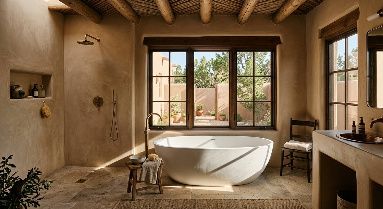
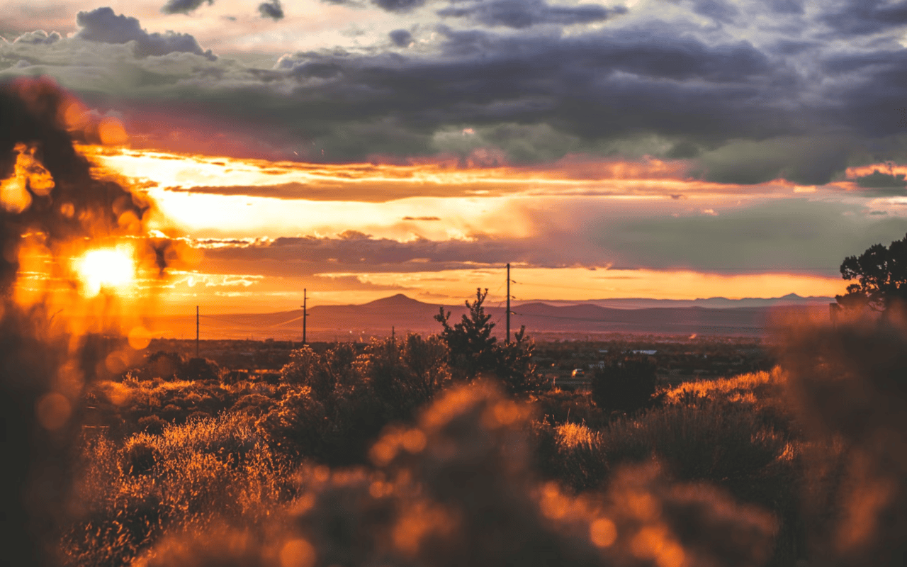
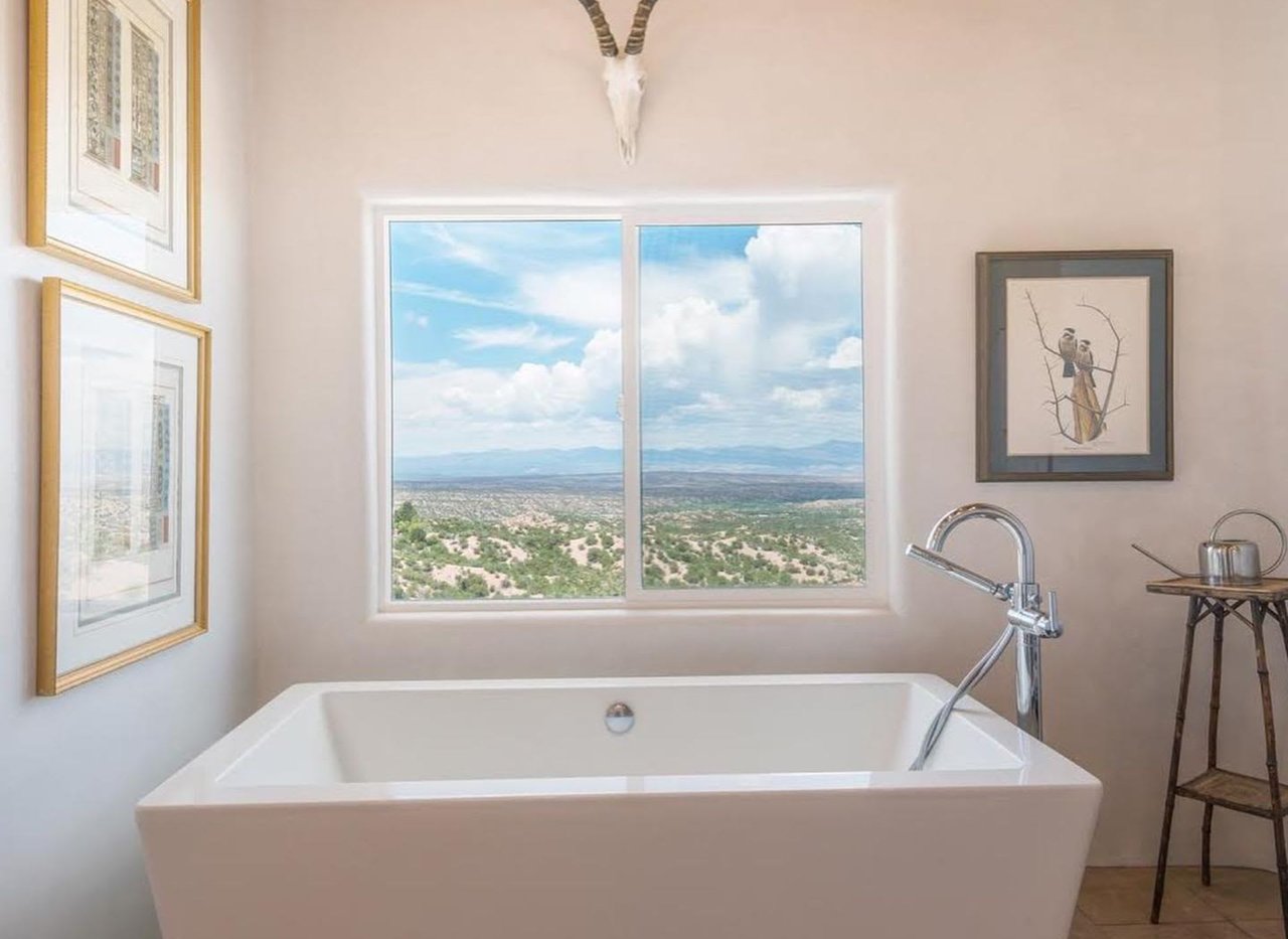
Walk through enough Santa Fe homes and you start to understand why color matters so differently here than in other parts of the country. The high desert light is unlike anything on either coast. It shifts through the day from crisp and cool in the morning to warm amber by late afternoon, and the way that light moves through a room changes how every color reads. Buyers who choose their palettes without accounting for New Mexico's distinctive light conditions often end up with spaces that feel off in ways they cannot immediately explain. Understanding the basics of color psychology, and how they apply specifically to Santa Fe interiors, makes every room more intentional and more livable.
Key Takeaways
-
Color directly influences how a room feels, not just how it looks, and the effect is measurable
-
Santa Fe's unique high desert light requires different color thinking than coastal or northern climates
-
The traditional Santa Fe palette of earth tones, turquoise accents, and warm neutrals is grounded in both aesthetics and psychology
-
Room function should guide color choice — the right palette supports what each space is actually used for
Why Color Psychology Matters in the Home
Color psychology is the study of how different hues affect mood, perception, and behavior. In interior design, it translates into a straightforward principle: the colors you surround yourself with shape how you feel in each space. Research consistently shows that warm tones tend to promote energy and social connection, while cool tones encourage calm and rest. Lighter colors make rooms feel more open; deeper hues create intimacy and focus.
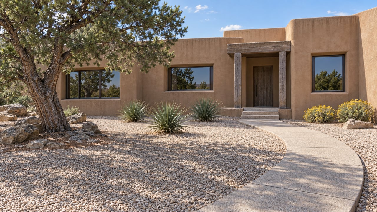
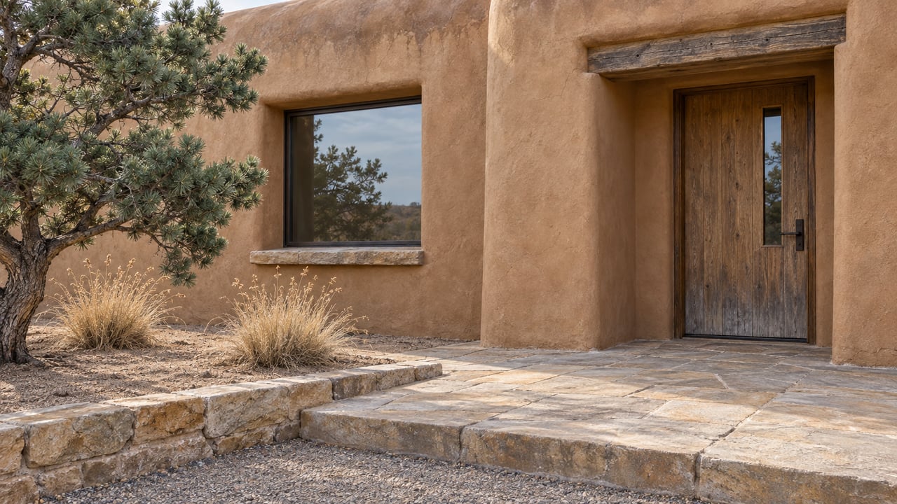
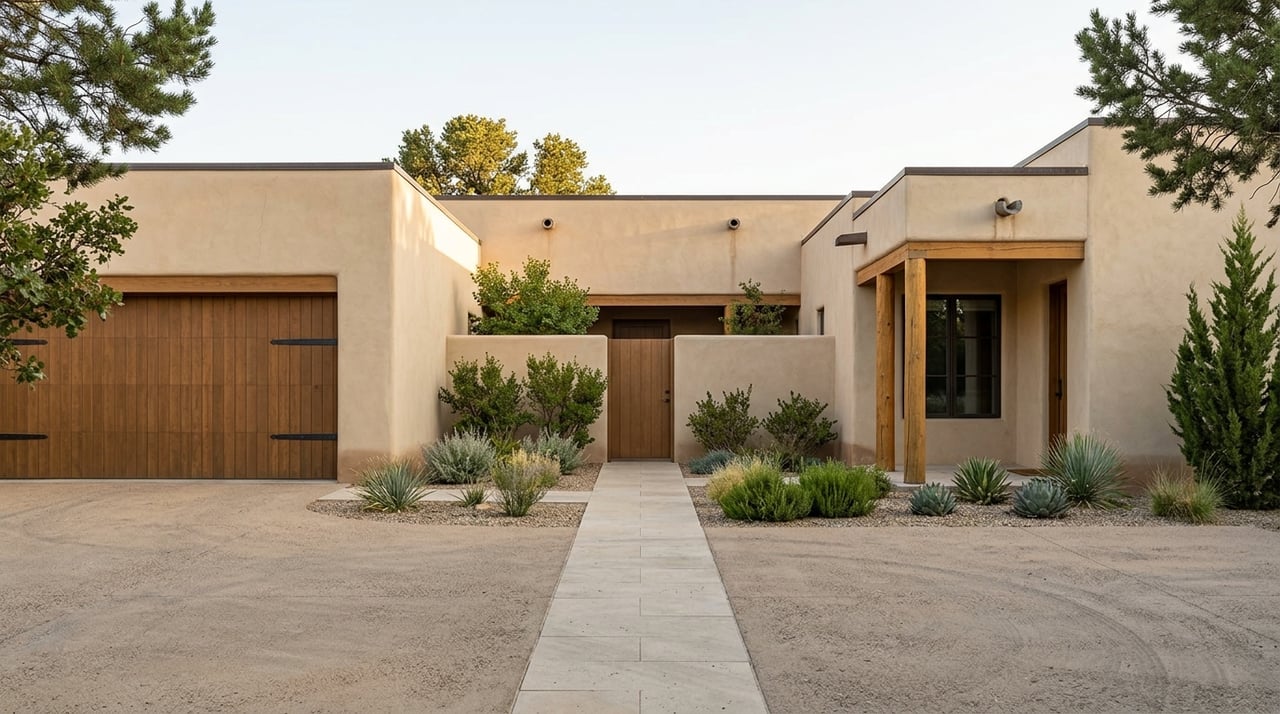
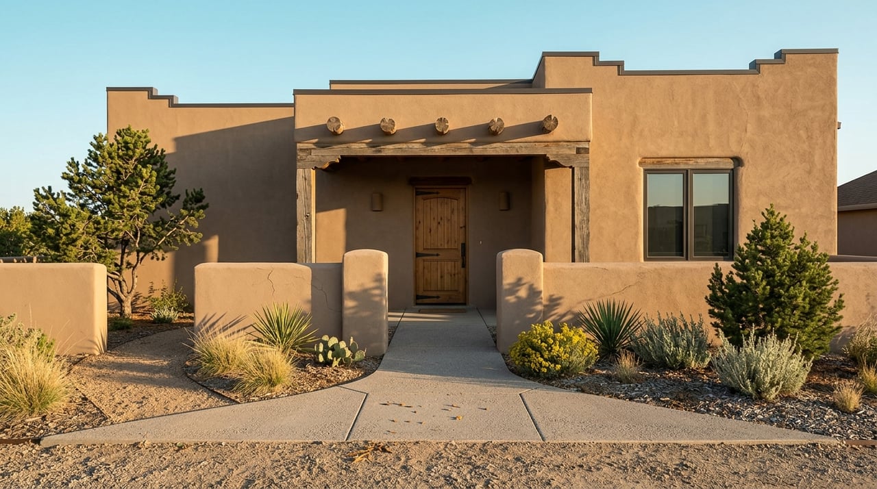
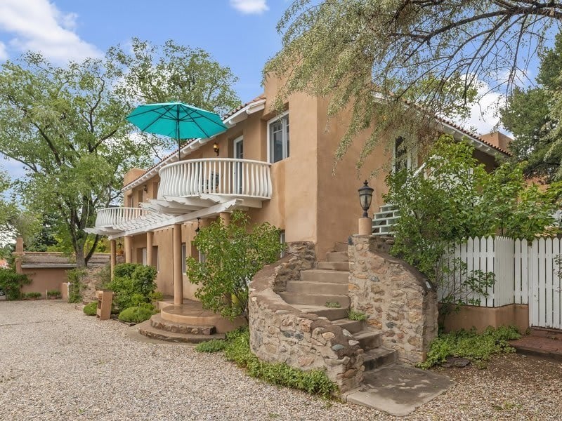
For Santa Fe homeowners and buyers, this matters for two reasons. First, the lifestyle that draws people to Santa Fe, whether retirement, relocation, or multigenerational living, tends to favor homes that feel restorative and grounded rather than stimulating and transient. Second, the architecture of adobe construction, with its thick walls, deep-set windows, and organic curves, responds to color in specific ways that standard suburban construction does not.
For Santa Fe homeowners and buyers, this matters for two reasons. First, the lifestyle that draws people to Santa Fe, whether retirement, relocation, or multigenerational living, tends to favor homes that feel restorative and grounded rather than stimulating and transient. Second, the architecture of adobe construction, with its thick walls, deep-set windows, and organic curves, responds to color in specific ways that standard suburban construction does not.
How color affects the experience of a room:
-
Warm tones like terracotta, ochre, and clay red create psychological warmth and tend to make large spaces feel more intimate
-
Cool tones like sage green, desert blue, and soft turquoise lower stress and promote a sense of calm, particularly effective in bedrooms and reading rooms
-
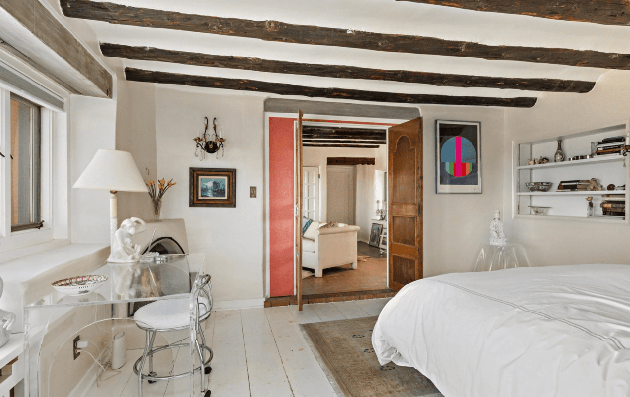
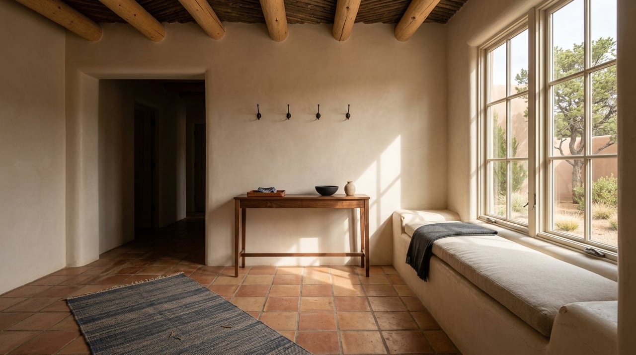
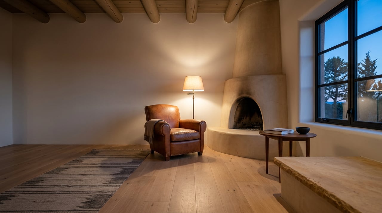
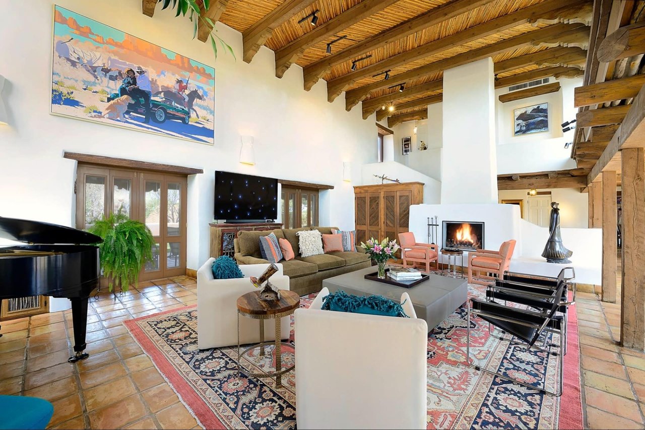
Neutral bases with warm undertones, the creams, bone whites, and sandy beiges common in Santa Fe interiors, provide visual rest while complementing bolder accent colors
-
Depth and saturation matter as much as hue, a dusty terracotta reads very differently than a bright orange even though they share the same color family
The Santa Fe Palette: Where Regional Character Meets Color Science
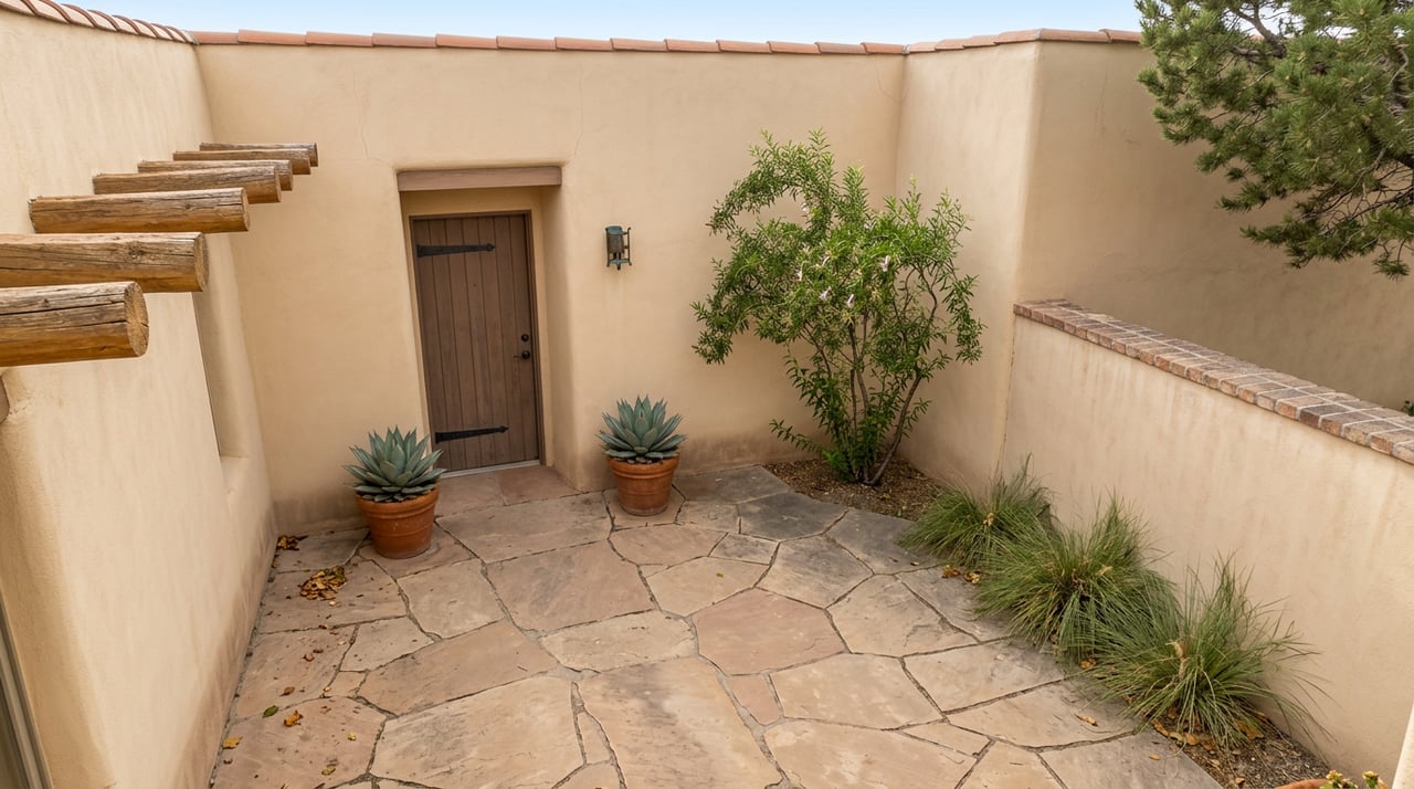
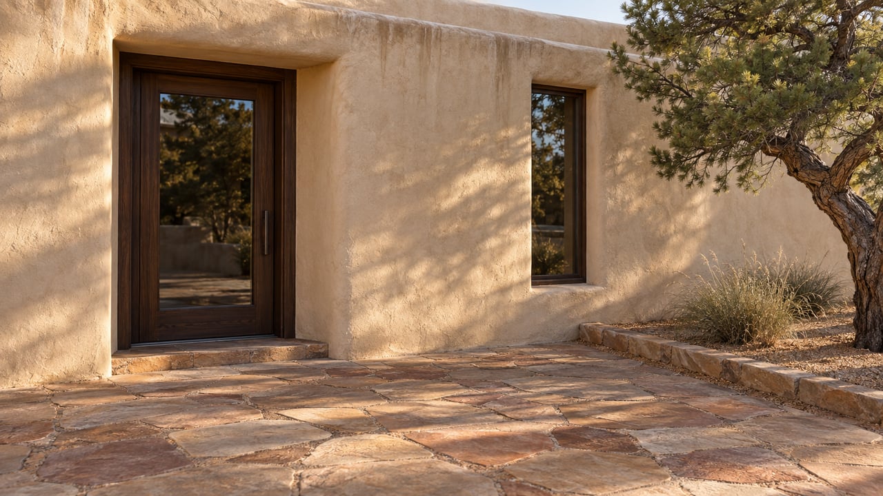
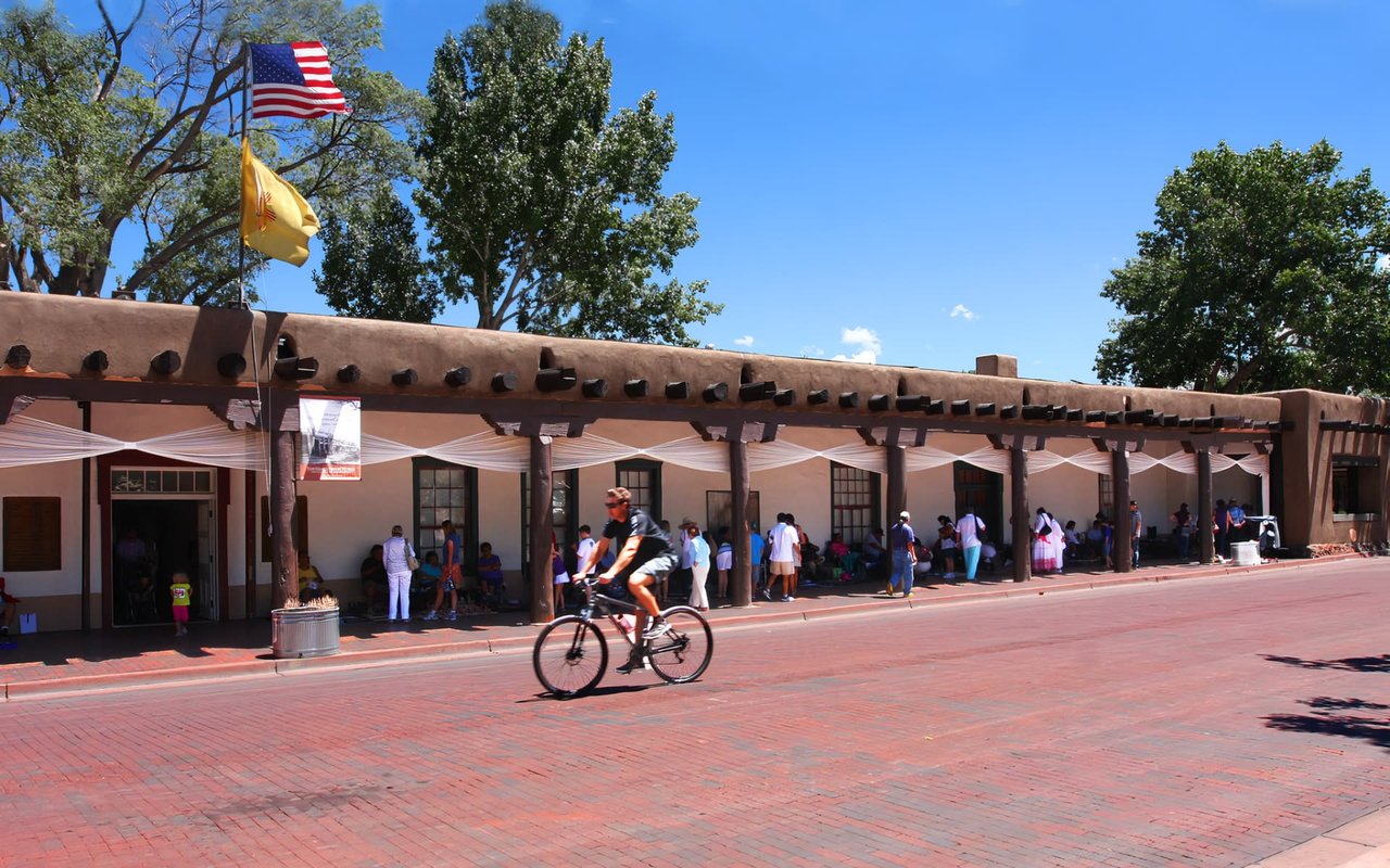
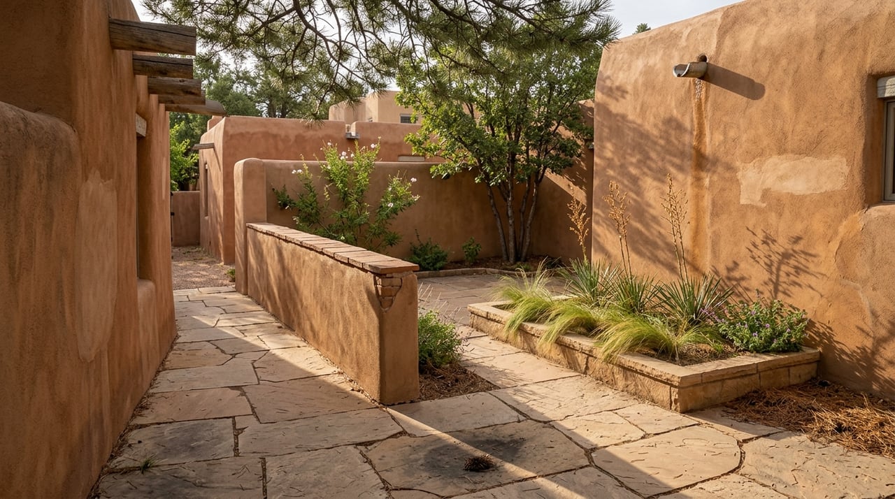
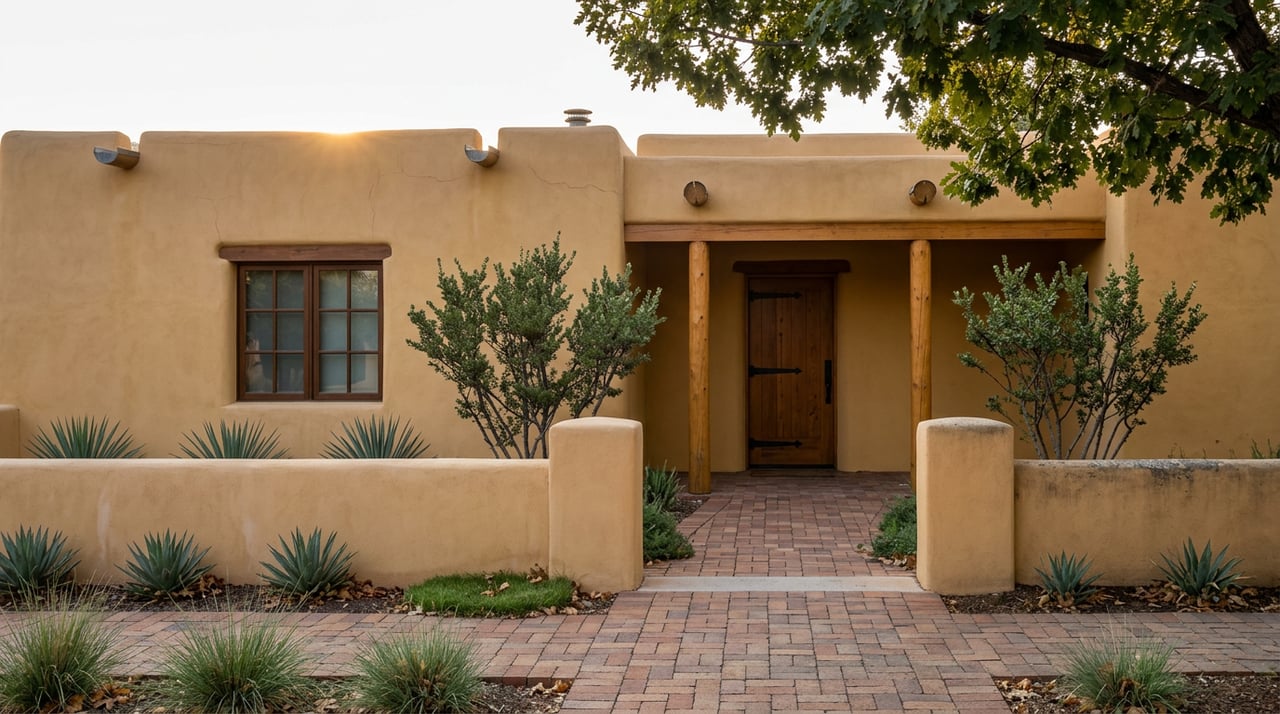
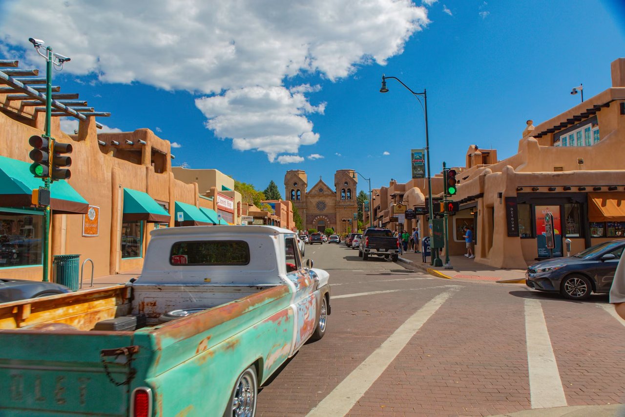
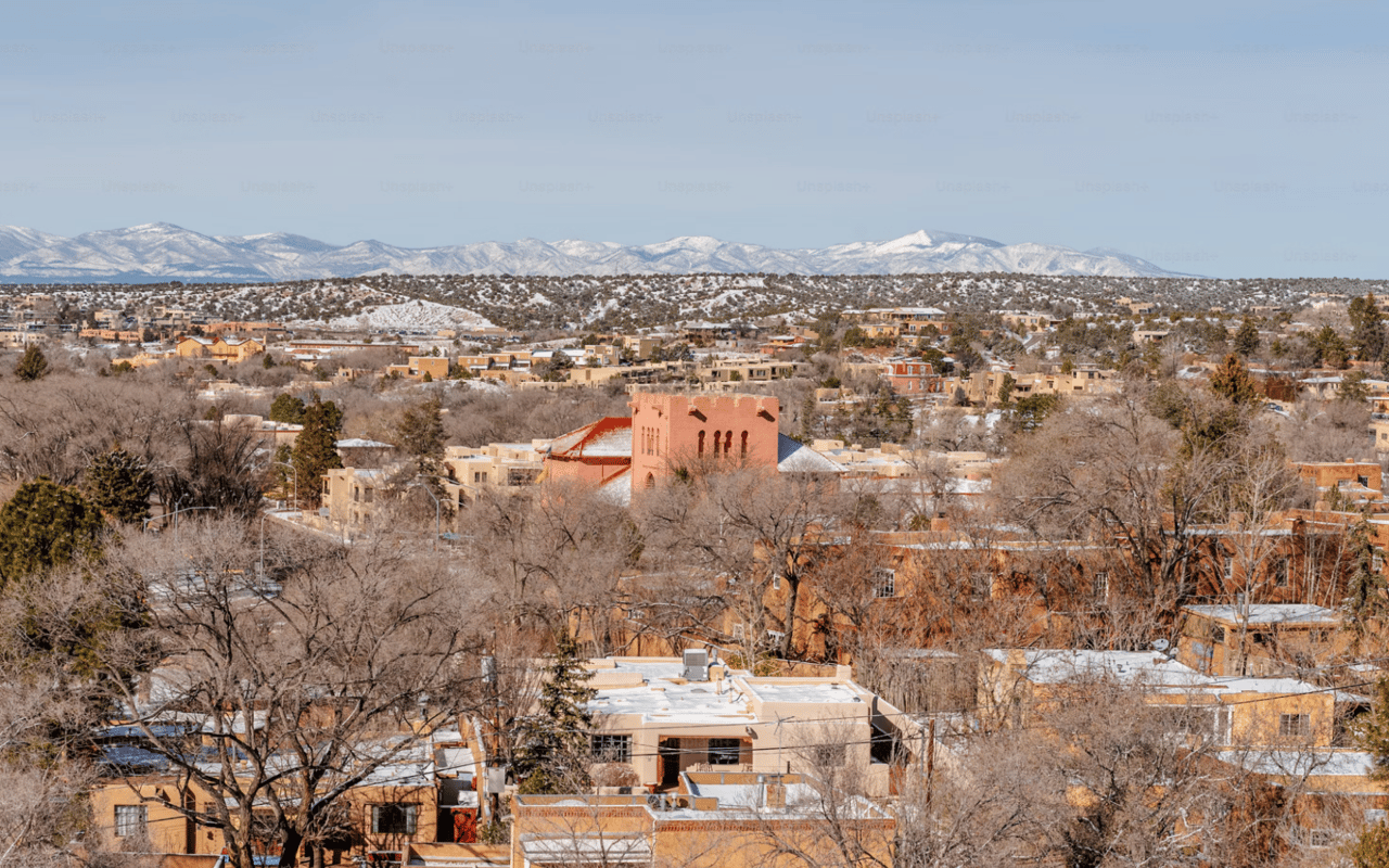
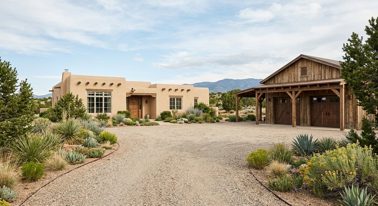
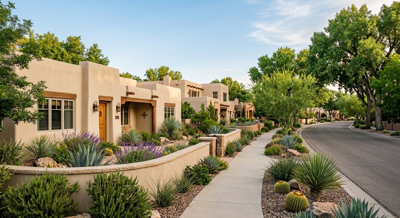
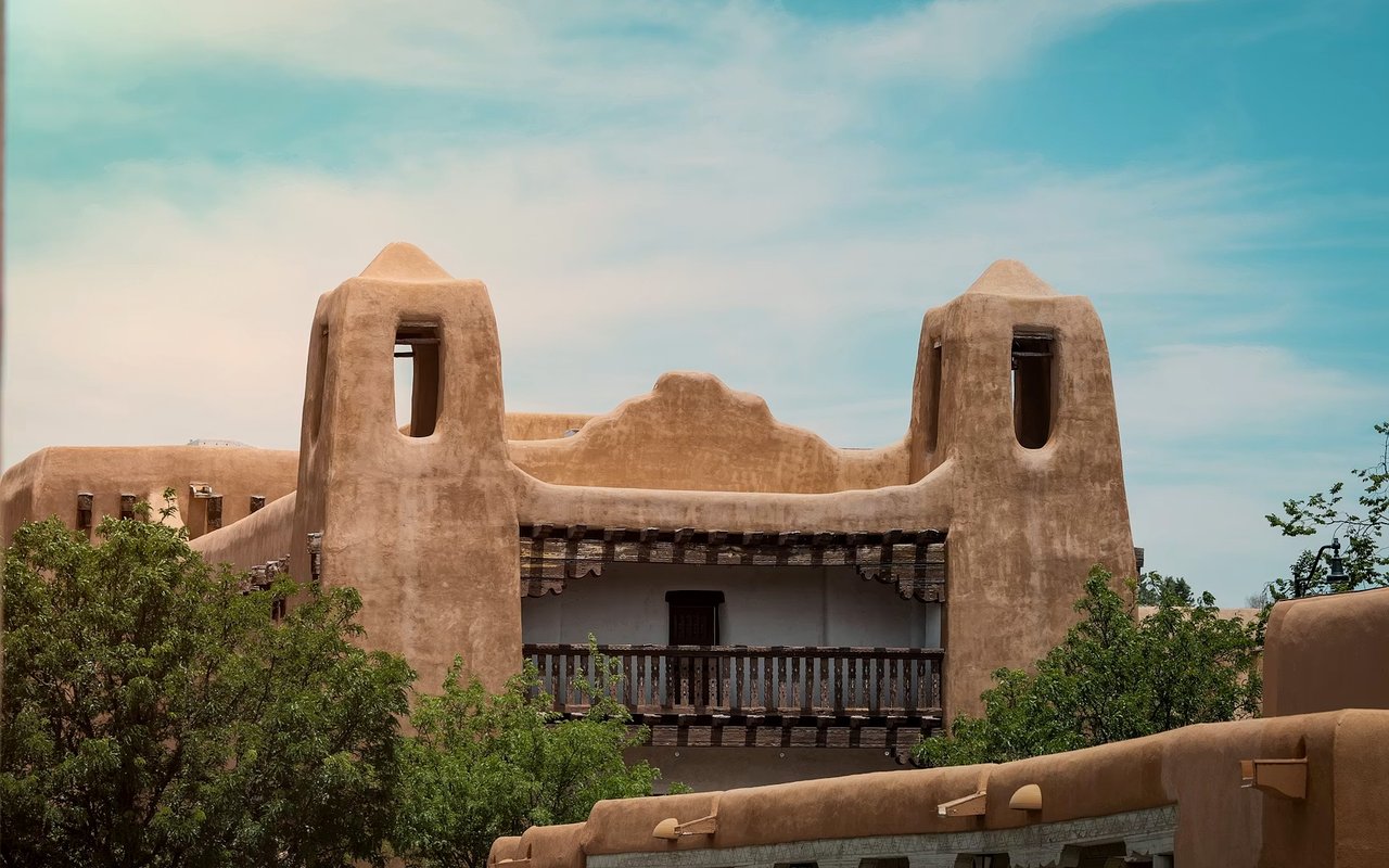
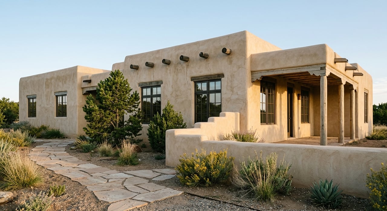
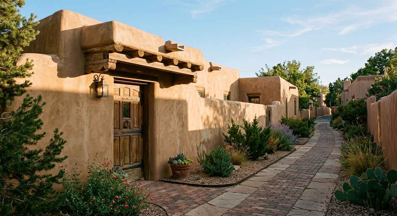
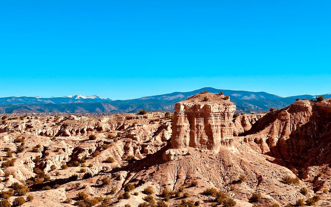
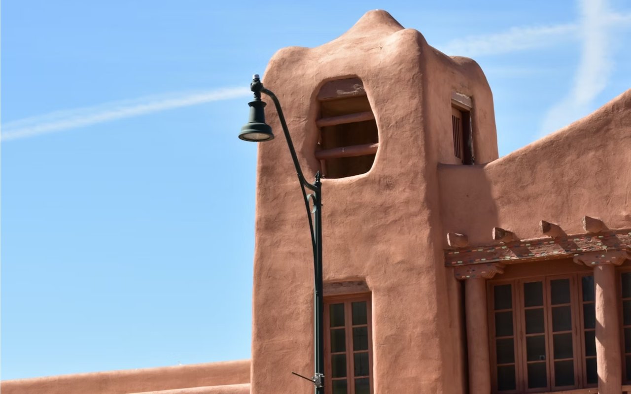
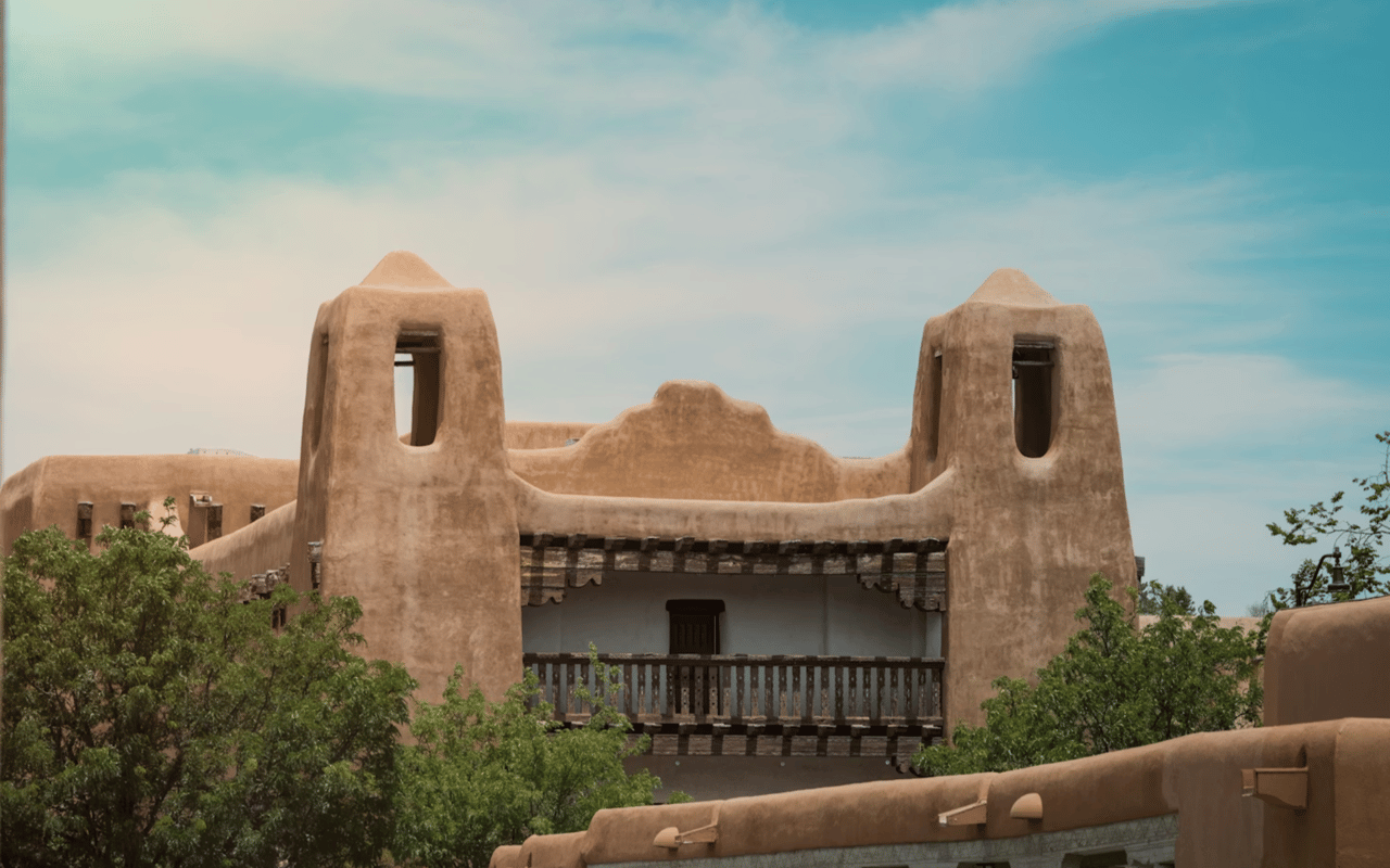
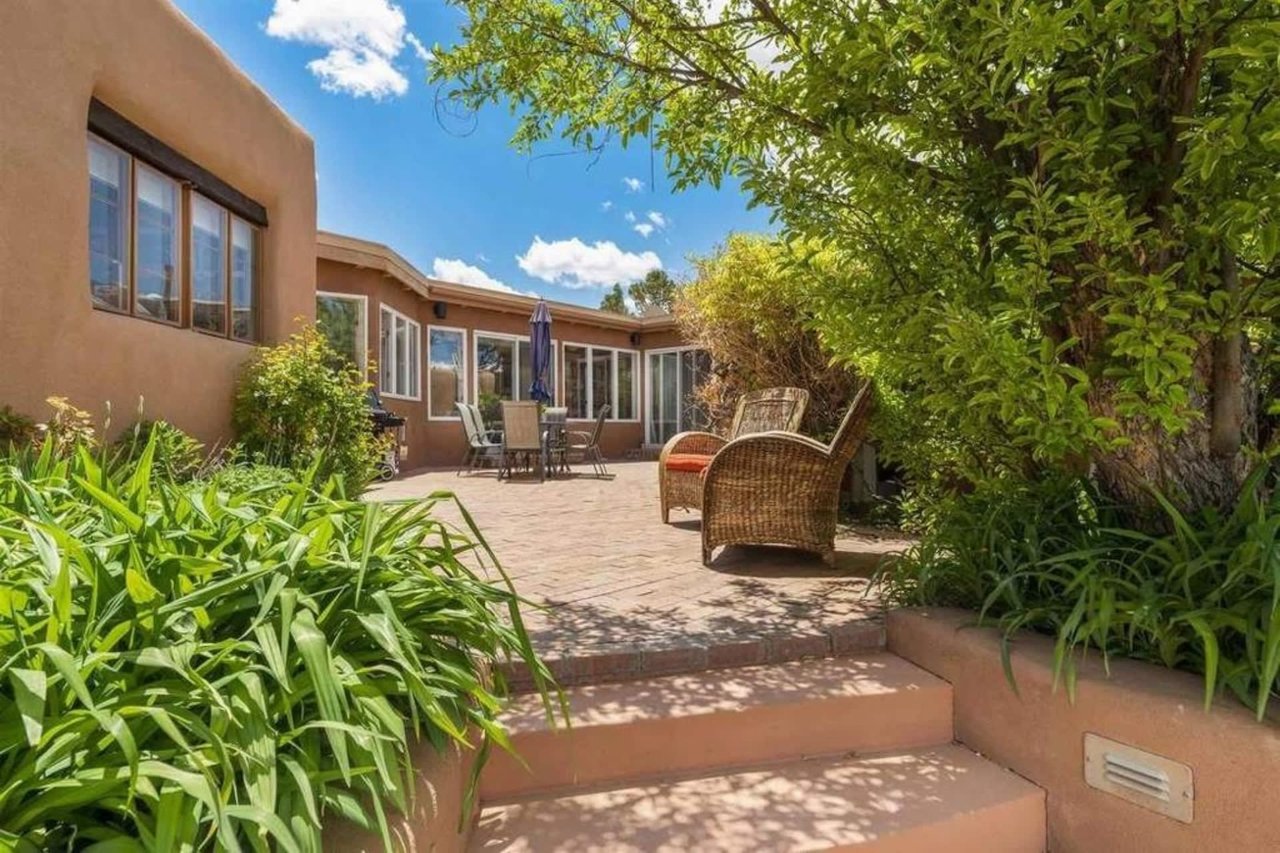
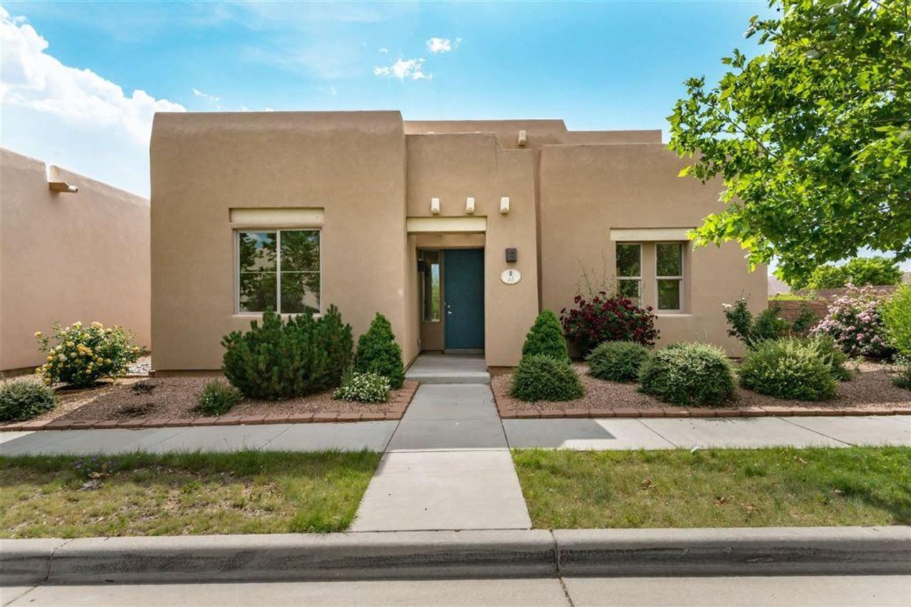
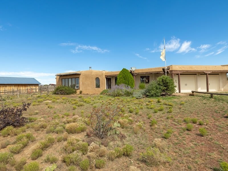
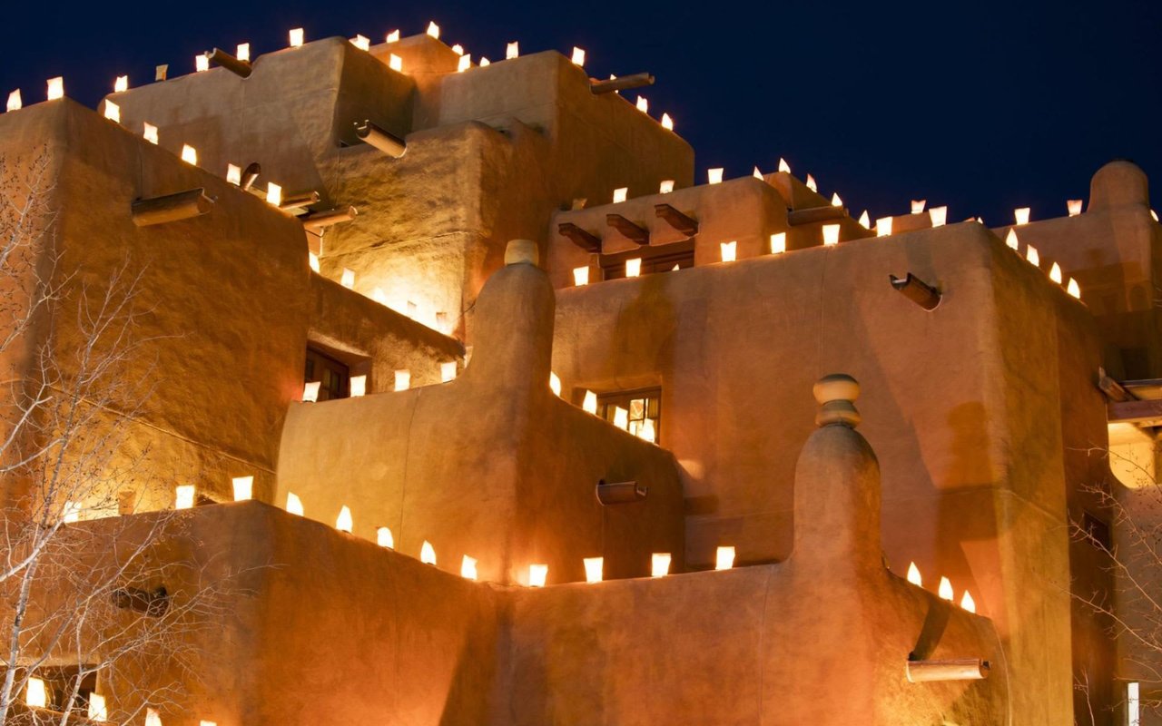
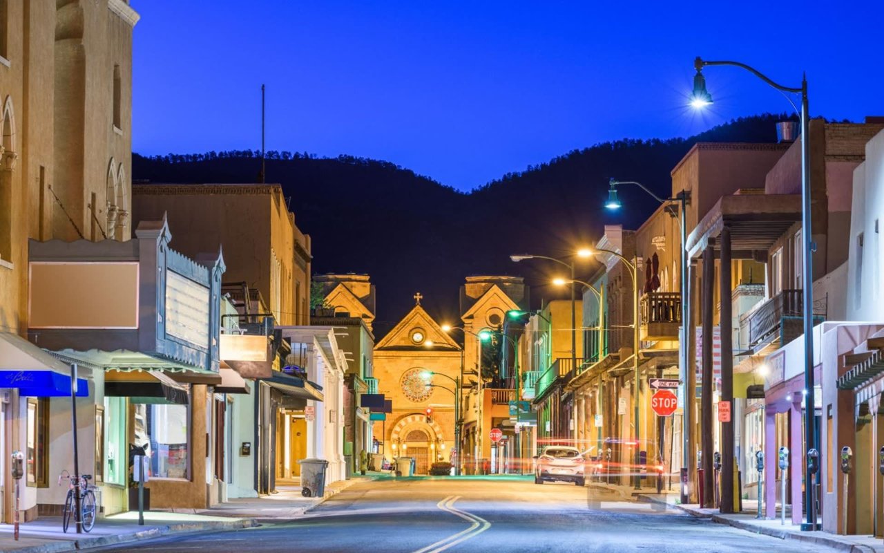
The traditional Santa Fe color palette was not invented by interior designers. It evolved from the landscape, the architecture, and the cultural traditions of the region over centuries. The adobe walls of the historic district, the clay reds and golden ochres of the surrounding high desert, the turquoise of traditional Pueblo and Spanish craft, and the sage greens of the pinon and juniper that cover the hills above the city all contributed to a palette that happens to align closely with what color psychology identifies as grounding and restorative.
Core colors of the Santa Fe palette and what they do:
-
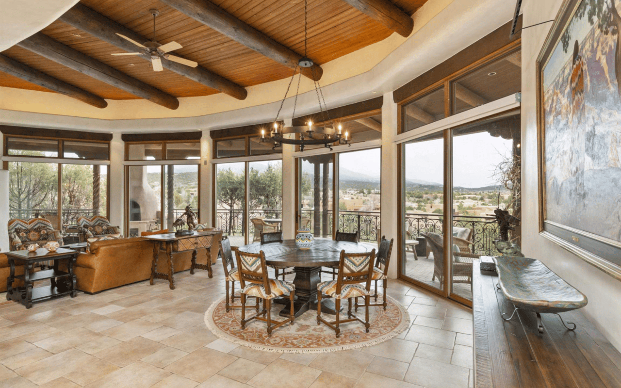
Warm earth tones (terracotta, clay red, golden ochre, warm tan): These are the foundation of most Santa Fe interiors. They create psychological warmth without the aggression of a bright red, and they age beautifully in adobe and plaster walls. They work well in living rooms, dining areas, and entryways where social interaction is the goal.
-
Sage green and desert greens: Associated with nature and calm, these tones lower cortisol levels and are well suited to bedrooms, offices, and spaces used for reading or quiet reflection. In Santa Fe homes, they complement both exposed wood beams and hand-plastered walls naturally.
-
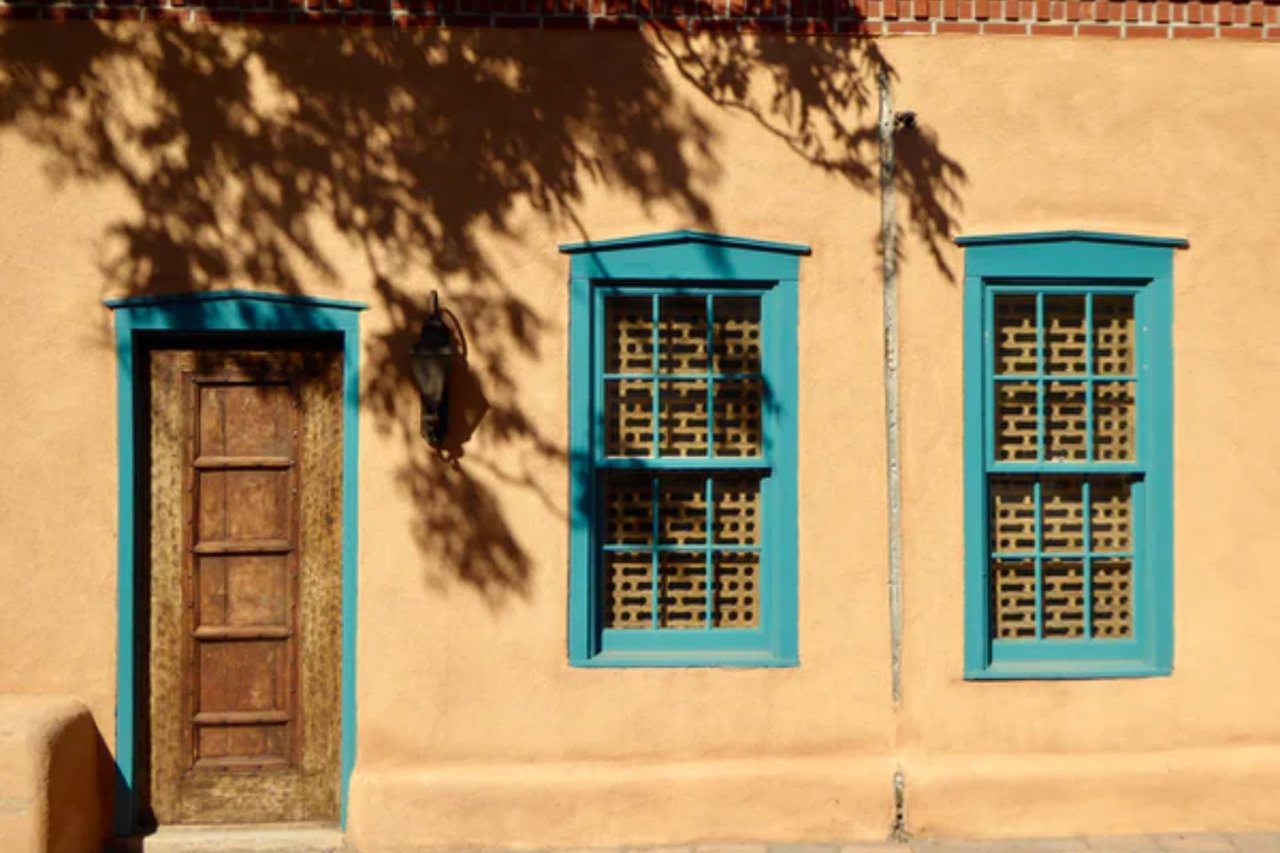
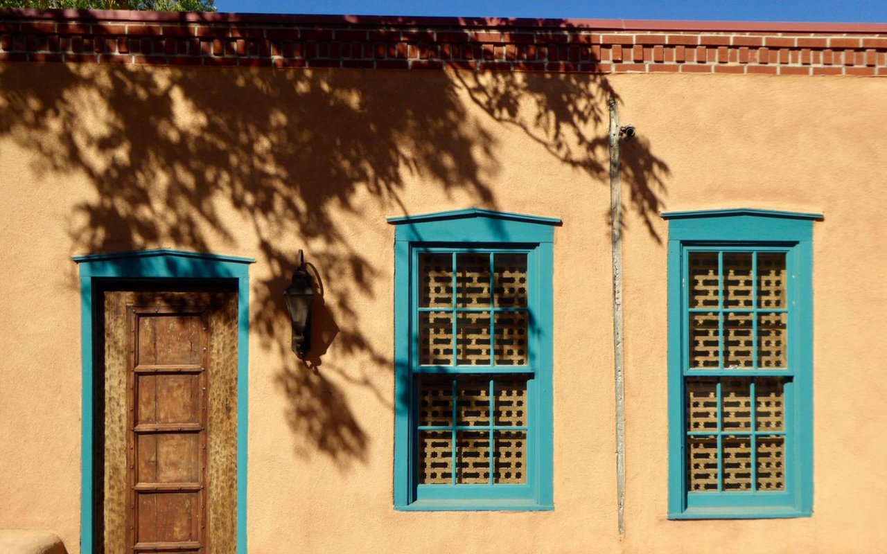
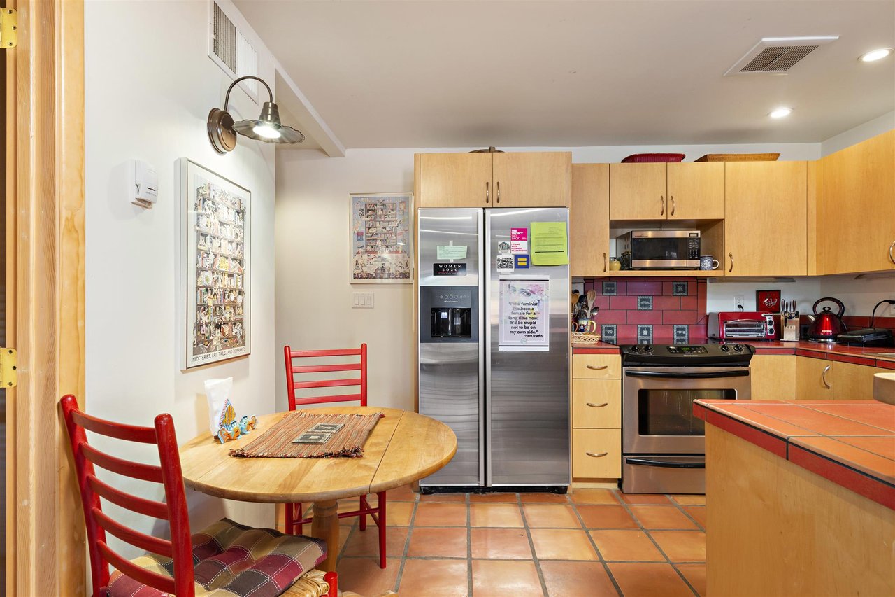
Turquoise and desert blues: Used as accents rather than primary colors, these bring the traditional Southwestern signature without overwhelming the grounded quality of the earth-tone base. A single turquoise door, a nicho painted in Taos blue, or a tile accent in a kitchen carries significant visual impact without disrupting the overall calm.
-
Warm neutrals and creamy whites: These function as relief colors throughout Santa Fe interiors, providing visual breathing room between more saturated tones. The key is choosing whites and neutrals with warm undertones, cool stark whites read as flat and lifeless against the warmth of adobe and high desert light.
Applying Color Room by Room
The most effective color strategies treat each room according to its function. A home that uses the same palette throughout often feels monotonous; one that shifts intentionally from room to room supports different activities and moods in each space.
Room-by-room guidance for Santa Fe homes:
-
Living and gathering rooms: Warm, inviting tones that support conversation and connection. Terracotta walls with neutral trim, or a warm ochre base softened by cream and wood tones, both work well. The 60-30-10 rule is useful here: roughly 60 percent dominant color, 30 percent secondary, and 10 percent accent, often a turquoise or deep clay red.
-
Bedrooms: Prioritize calm and rest. Sage greens, muted desert blues, soft lavenders, and warm neutrals all promote relaxation. Avoid high-contrast palettes or saturated warm colors in rooms where sleep is the priority.
-
Home offices and studies: Colors that support focus without inducing fatigue. Soft greens and muted blues have both performed well in research on concentration and cognitive function. Avoid overly bright or stimulating tones in spaces where sustained mental work happens.
-
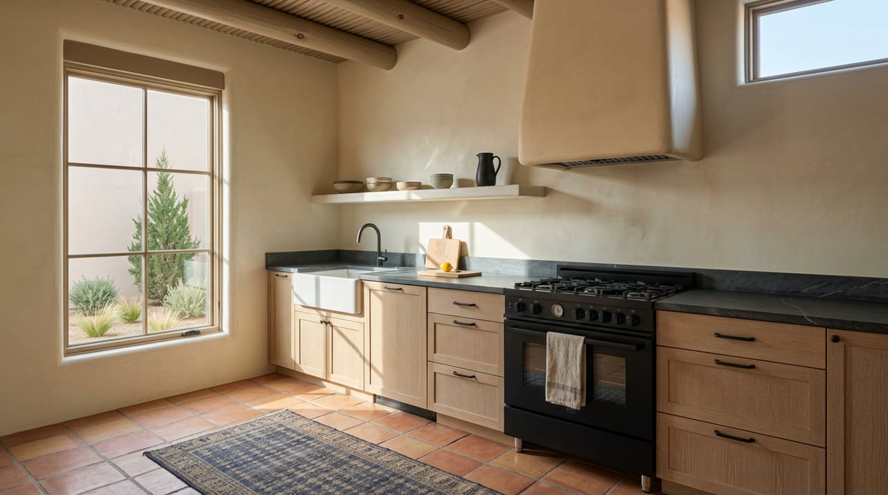
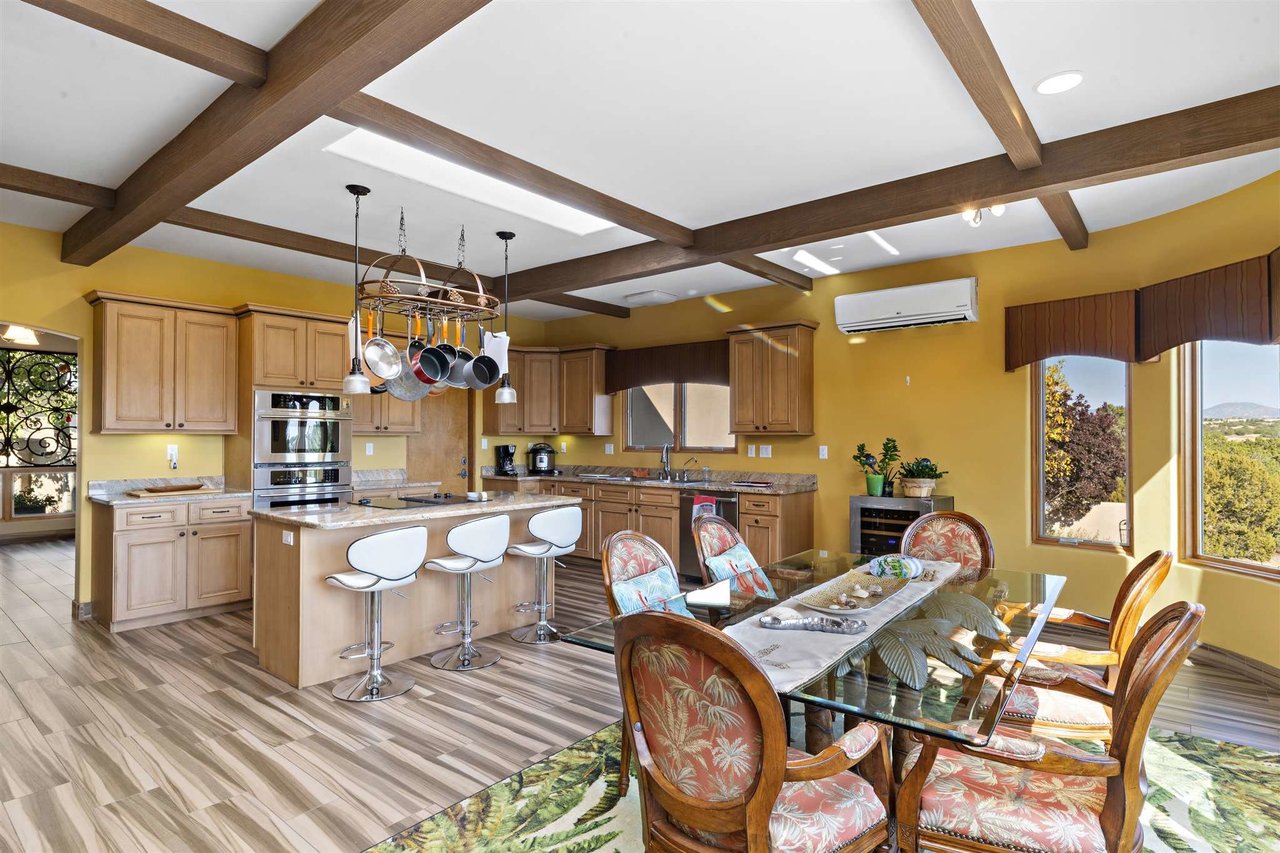
Kitchens and dining areas: Warm tones that make the space feel alive without being aggressive. Sandy tans, warm whites, and earthy accents work well. Bright accent tiles in traditional Talavera patterns are common in Santa Fe kitchens and add both color and cultural character.
-
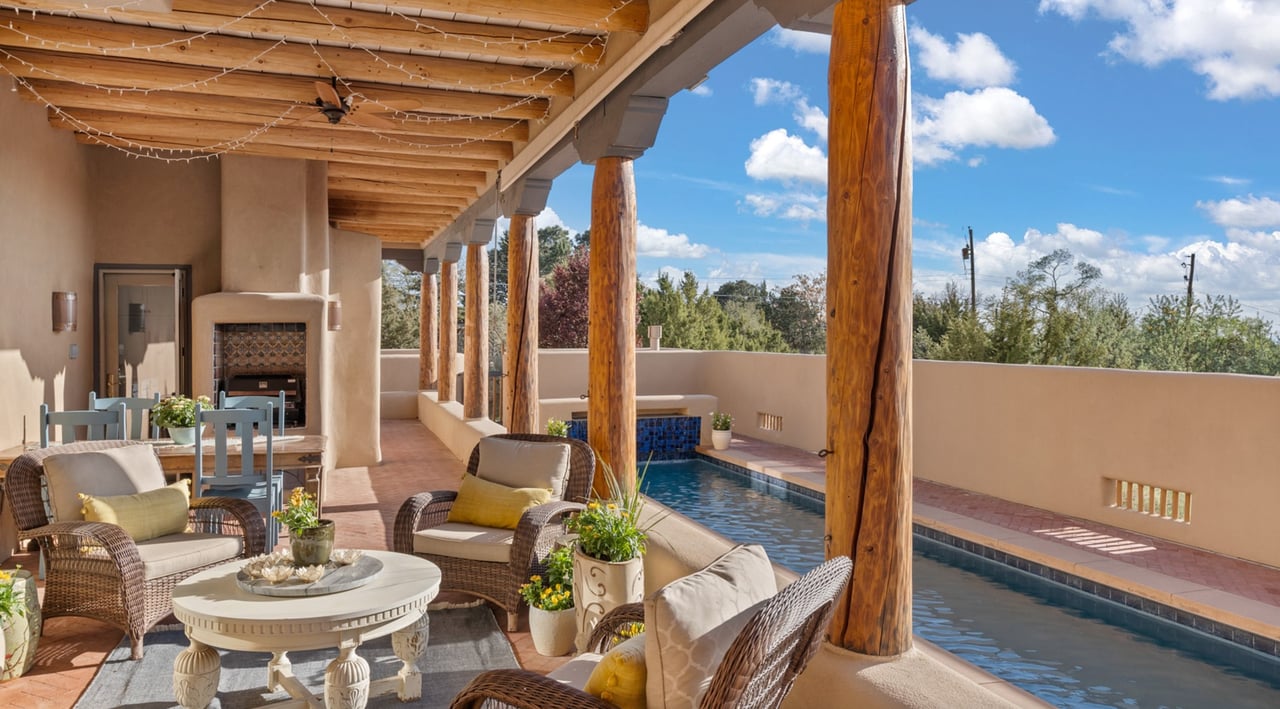
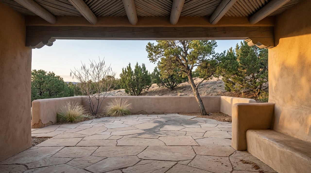
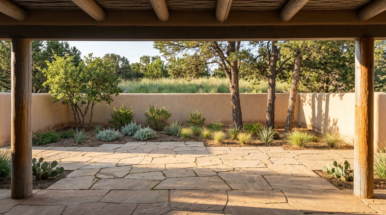
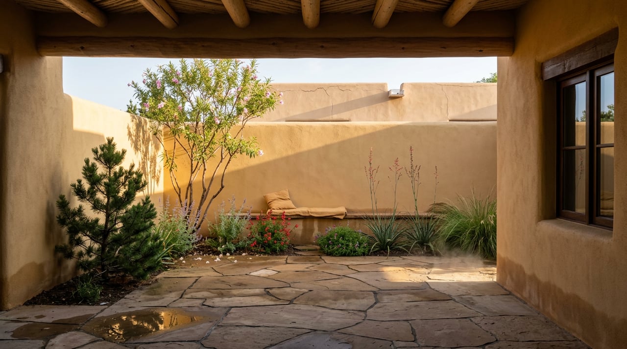
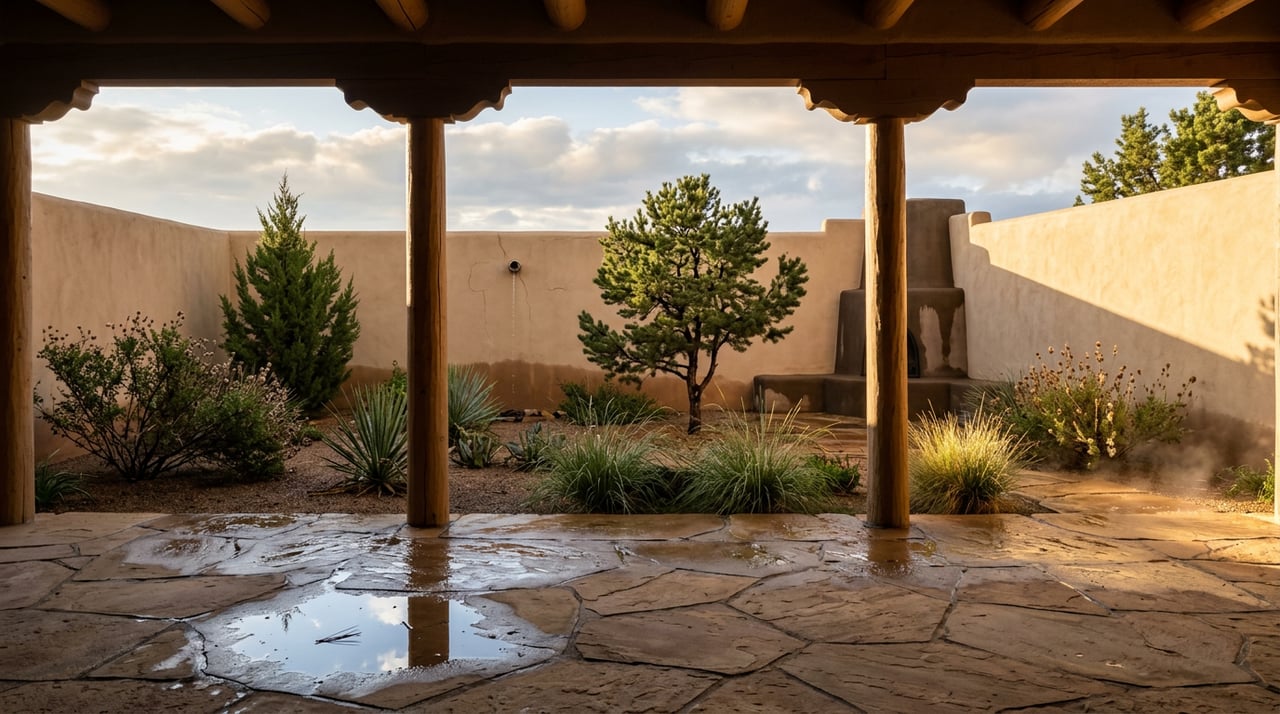
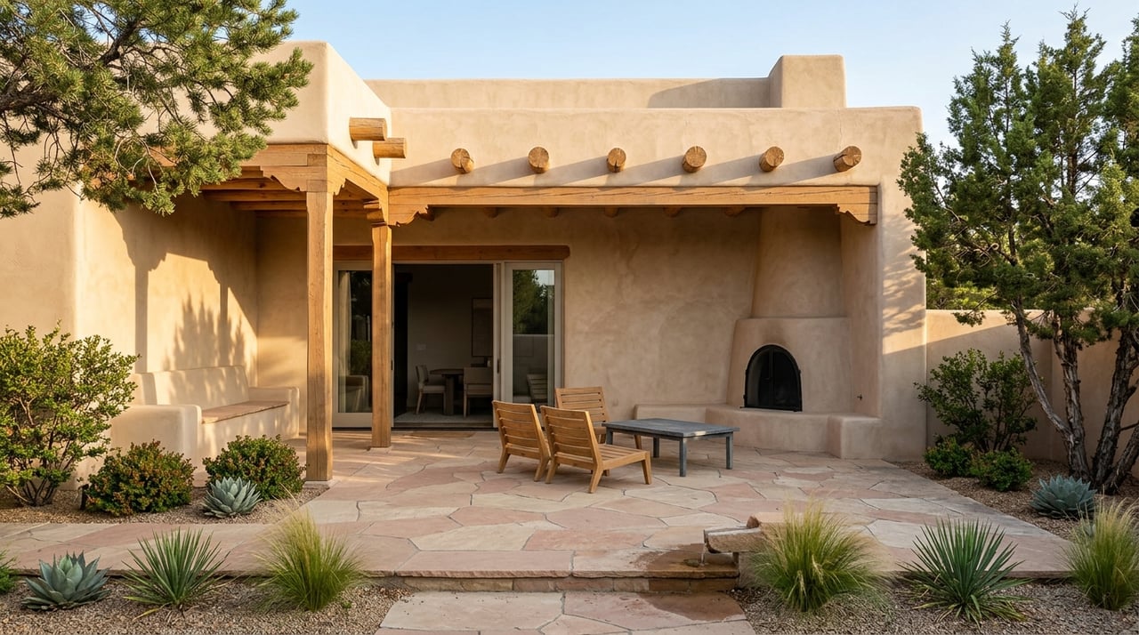
Portals and outdoor living areas: These transitional spaces between indoors and the New Mexico landscape benefit from colors that bridge the two. Warm neutrals with natural wood and stone accents let the surrounding high desert do most of the work.
Practical Considerations Before You Paint
Color decisions that work in a showroom or on a phone screen often surprise people when they go on the wall. Santa Fe's light conditions make this gap particularly pronounced.
What to do before committing to a color:
-
Sample directly on the wall and observe at different times of day, morning light and late afternoon light in New Mexico read very differently on the same surface
-
Test colors in the actual room rather than a hallway or adjacent space, where lighting conditions differ
-
Consider how the color interacts with existing fixed elements: tile, wood beams, stone floors, and plaster finishes all influence how a paint color reads
-
Account for how much natural light the room receives, north-facing rooms in Santa Fe benefit from warmer palettes to offset the cooler indirect light
Frequently Asked Questions
Should I stick to traditional Santa Fe colors or can I use a more contemporary palette?
Both work well in Santa Fe homes. The traditional earth-tone palette is grounded in the local landscape and architecture and tends to feel authentically rooted in place. Contemporary interpretations that use the same warm neutrals with cleaner lines and updated accents can feel fresh without losing the character of the home. The key is choosing a palette that complements the architecture rather than working against it.
Does color choice affect home value when selling?
Yes, in a meaningful way. Research shows the overwhelming majority of homebuyers say color influences their purchase decision. In the Santa Fe luxury market, where buyers respond strongly to a sense of place and authenticity, interiors that honor the regional palette tend to show better and generate stronger emotional responses during tours. Stark, trendy palettes that ignore the local aesthetic can work against a home in this market.
How do I choose accent colors without the space feeling busy?
Limit accent colors to one or two per room and introduce them through objects, textiles, and architectural details like nichos or tile rather than large wall surfaces. Turquoise, deep red, and sunset orange are all effective Santa Fe accent colors precisely because they carry visual weight without needing a large footprint.
Work With Santa Fe Real Estate Experts Who Know This Market
Color and design are part of how we think about every Santa Fe property we show, because the way a home feels inside is inseparable from its value and its livability. The Ricky Allen and Tara Earley team brings decades of experience in Santa Fe real estate, and we understand what makes these homes work at the highest level.
Reach out to us to learn more about how we help buyers and sellers make the most of Santa Fe luxury real estate.
Reach out to us to learn more about how we help buyers and sellers make the most of Santa Fe luxury real estate.